
The Hidden Detail In The Starbucks Logo That Most People Don’t Know About
Starbucks has become a staple of many morning routines, providing that essential caffeine kick to start the day. But did you know there’s a hidden secret in the Starbucks logo?
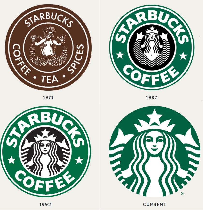
The logo features a siren, a figure inspired by sea myths and reminiscent of characters from Herman Melville’s *Moby Dick*. In fact, the Starbucks name itself is a nod to this literary classic.
Over the years, the Starbucks logo has evolved. Starting as a brown emblem, it transformed into the iconic green design in 1987, and later, in 2011, the text “Starbucks Coffee” was removed to let the siren shine. But here’s where it gets intriguing—”there’s a subtle quirk in the siren’s features.” While her face appears symmetrical, a closer look reveals that the right side is slightly shadowed, giving her a more human-like, imperfect charm.
Next time you’re sipping your latte, take a moment to appreciate the siren’s secret—a touch of humanity hidden in plain sight. Who knew your coffee cup could tell such an enchanting tale?